Color Psychology: Choosing Jewelry Displays to Complement Your Jewelry
Posted by ZakkaCanada on 17th Dec 2023
When it comes to showcasing your jewelry, choosing the right displays can make all the difference in attracting customers and boosting sales. Beyond aesthetics, colors play a crucial role in influencing shoppers' emotions and perceptions of your products.
In this article, we'll explore the fascinating world of color psychology and provide valuable insights for selecting jewelry displays that not only enhance the beauty of your pieces but also align with your brand's message.
What Color is Best for Jewelry Display?
Reflecting Jewelry's Personality
Jewelry displays should match the style and personality of the jewelry, resonating with the targeted customer's taste. This enhances the connection between the product and its potential buyers, creating an appealing presentation.
Contrasting Backgrounds for Highlighting Jewelry
It's essential for jewelry to stand out against display backgrounds. Contrasting colors ensure that the jewelry remains the focal point. For instance, a clear crystal quartz pendant might be invisible on a leopard print, whereas a chunky silver cuff bracelet would be striking on the same. 
Unified Color Schemes
A professional-looking display involves a unified color scheme. Limiting display elements to no more than three colors, like gray, white, and blue, and three textures, such as stone, lace, and linen, can significantly enhance the overall aesthetic and make jewelry stand out.
Visual Interest and Dynamics
Creating visual interest in jewelry displays can involve varying heights and angles. Dynamic elements like diagonals and large photographs of the jewelry can capture attention and add sophistication to the display.
The most effective colors for jewelry displays depend on the type of jewelry you're selling and the ambiance you want to create in your store or online shop. However, some general guidelines can help you make an informed decision:
1. Neutrals: Colors like white, black, and gray create a timeless and elegant backdrop for jewelry, allowing the pieces to take center stage. They exude sophistication and can adapt to various jewelry designs.
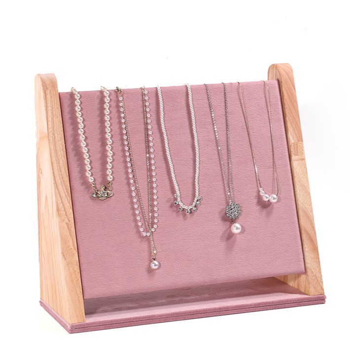
2. Pastels: Soft hues like light pink, lavender, and mint green evoke a feminine and delicate feel. These colors are often associated with femininity and romance, making them ideal for displaying delicate jewelry such as necklaces and earrings.
3. Bold Colors: Vibrant shades like red, orange, and yellow draw attention and exude energy. They're an excellent choice for showcasing statement pieces or creating a dynamic and visually appealing display.
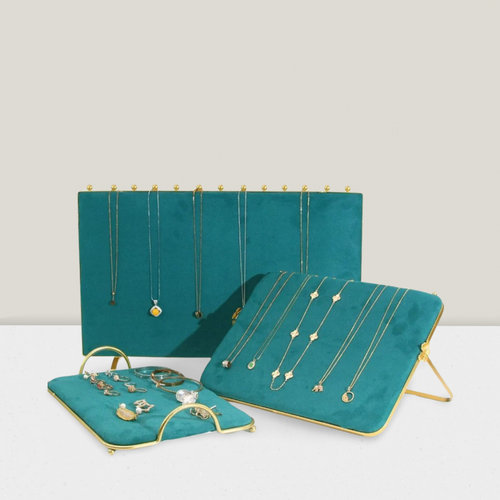
4. Jewel Tones: Deep, saturated colors like emerald green, sapphire blue, and amethyst add a touch of luxury and opulence to jewelry displays. They create a sense of elegance and sophistication, highlighting the richness and depth of the jewelry.
Colors for Jewelry Branding
Consistency in Branding
High-end jewelry brands consistently follow the principle of maintaining a consistent color palette across their website, branding, packaging, and social media content. This consistency makes the brand recognizable and aesthetically pleasing, ensuring a cohesive visual identity.
Benefits of a Consistent Palette
A consistent color palette aids in brand recognition, professional appearance, and ease of creating visually appealing photography across various platforms. This coherence in color use across different mediums enhances the brand's professional image and appeal.
Beyond the immediate impact on visual appeal, colors play a significant role in establishing your brand's identity and communicating its values:
1. Neutral Colors: Neutrals convey a sense of stability, trust, and professionalism. They're a great choice for brands that want to project a classic and reliable image.
2. Warm Colors: Warm colors like red, orange, and yellow exude warmth, friendliness, and optimism. They're ideal for brands that want to evoke a sense of excitement and energy.
3. Cool Colors: Cool colors like blue, green, and purple are associated with calmness, serenity, and sophistication. They're a good choice for brands that want to portray a sense of tranquility and elegance.
4. Complementary Colors: Using complementary colors, such as blue and orange or red and green, creates a striking and harmonious effect. This approach is great for brands that want to make a bold statement and stand out from the competition.
In conclusion, choosing the right colors for your jewelry displays and branding is essential for creating a compelling and cohesive customer experience. By understanding the psychology behind colors, you can effectively communicate your brand's message, attract customers, and increase sales.


